How Will Pantone’s 2021 Colours Affect 2021 Trends?
Pantone has long been hailed as the colour expert in the world of design and their ‘Color of the Year’ is a highly anticipated decision that affects everything from graphic design to haute couture. So, how will this year’s pick affect what we’re buying?
Source: Pexels
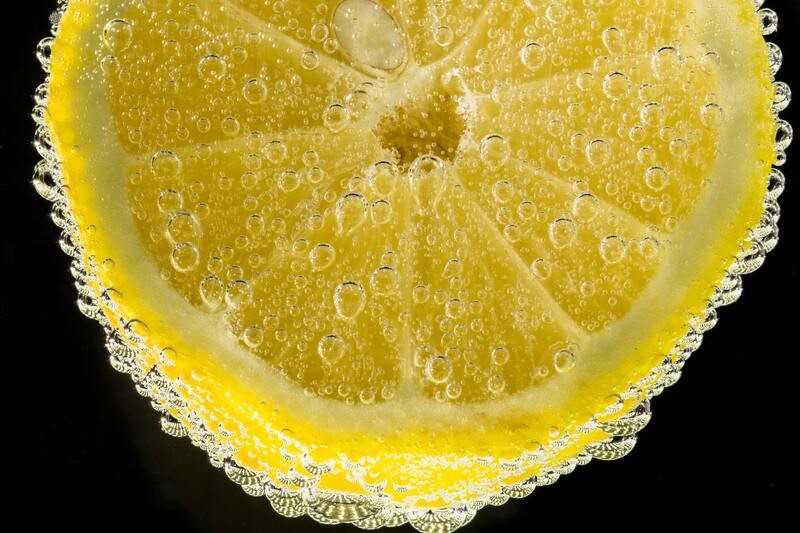
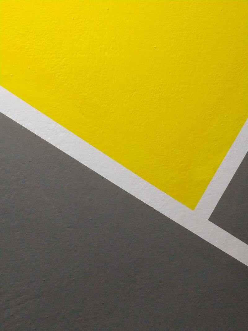
Firstly, what is the colour this year? Well, as in 2016, they decided that two was better than one for 2021, and they are Ultimate Gray (a clean, light grey) and Illuminating (a bright, soft-lemon yellow).
These choices say a lot about the year ahead, Pantone’s website claims that the combination represents “A message of happiness supported by fortitude.” The juxtaposition between the bright and the subdued is more subtle than light vs dark, and allows for wider interpretation. As fashion is always supported by the messages that its designers want to convey, it isn’t surprising that colour choice is a big part of creating the story behind a collection.
It is already possible to see the influence of these colour choices from the past, such as in 2019, when Pantone chose Living Coral for the year. As the colours are picked before they are revealed, it was interesting to see Apple release the iPhone XR in 2018 in an array of colourful shades, including a bright, energising coral. Three months later, Pantone revealed that they had chosen almost exactly the same shade.
One of the most obvious examples of this influence was the 2016 choice of Rose Quartz, a gentle baby pink. It was chosen alongside Serenity, a soft-toned blue/purple shade, however, the pink proved to be the more popular choice and was seen throughout fashion and design everywhere and was dubbed ‘millennial pink’, defining an entire generation rather than just a year. Notably, the skincare and cosmetics company Glossier, which was founded in 2010, saw a huge growth of 600% from 2015-2016. And you guessed it, the branding is almost entirely built around ‘millennial pink’.
Source: Pexels
Pantone hasn’t chosen a yellow for the title since 2009, when the warm shade ‘Mimosa’ was picked. But as big designers and fashion houses prepare their SS21 collections ahead of time, we can already see the influence of the bright, cheerful tone. The colour is particularly popular with women’s luxury bags as well as neckties and shoes, the bold nature of yellow means that it lends itself to smaller items, allowing fashion-lovers to add a pop of colour without overdoing it.
Ultimate Gray is a shade that is expected to be popular with technology, thanks to its simplistic and clean-cut nature. With lots of tech being released in 2021, like Samsung Galaxy S21, and Nintendo Switch Pro, we will hopefully be able to track the influence of Pantone’s annual colour choice across the year. Recently, colourful technology has become popular, such as the aforementioned iPhones, but there is a timeless element to grey that means it will always have a place in graphic and hardware design.
As we enter 2021, the idea of stability is more appealing than ever, and this will be evident in the products that we buy, but the importance of the combination can’t be understated – as joy and hope are equals to power and strength, and it’s this balance that designers will be hoping to find.