
Burberry Prorsum
[sublimevideo poster=”/wp-content/uploads/2013/06/man_catwalk_yourself_SS14_burberry.jpg” src1=”/wp-content/uploads/2013/06/Man-Catwalk-Yourself-Ss14-Burberry-1.mp4″ width=”” height=””]
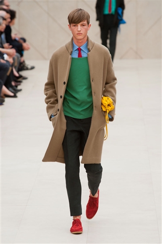
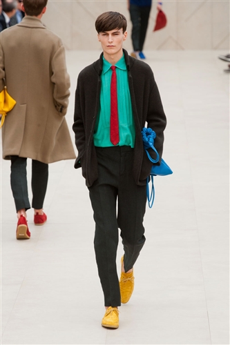
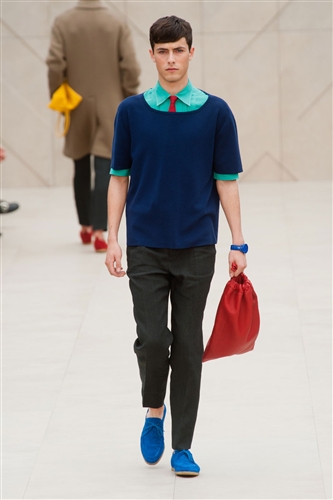
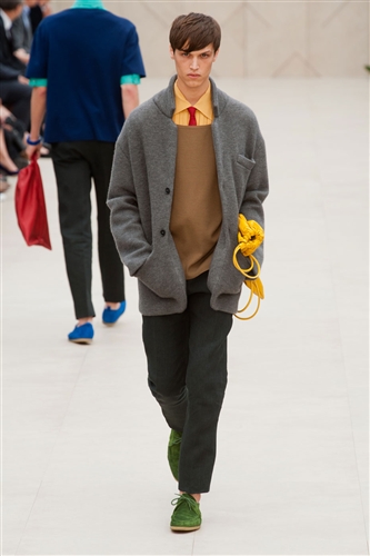
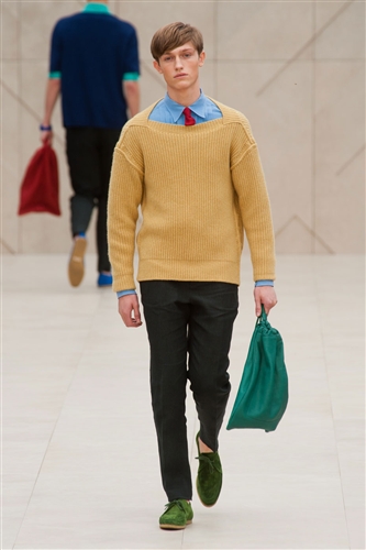
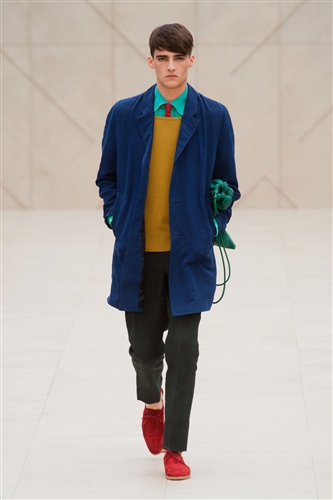
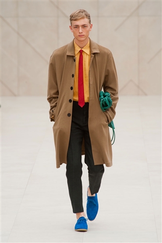
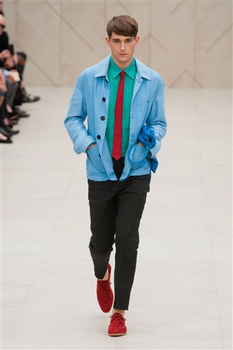
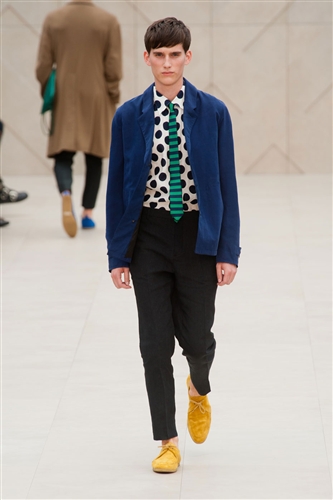
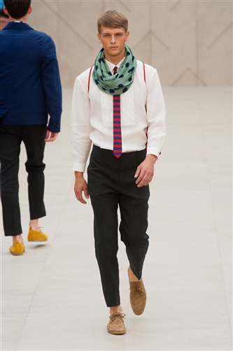
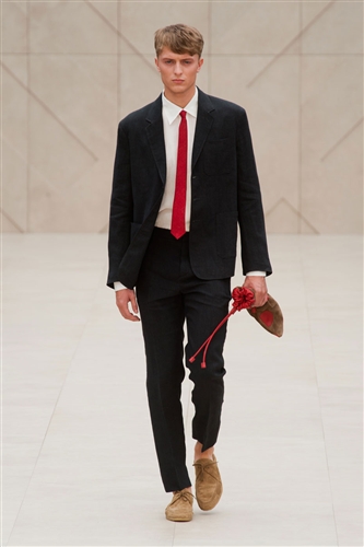
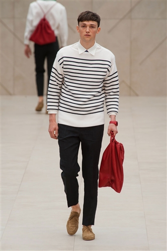
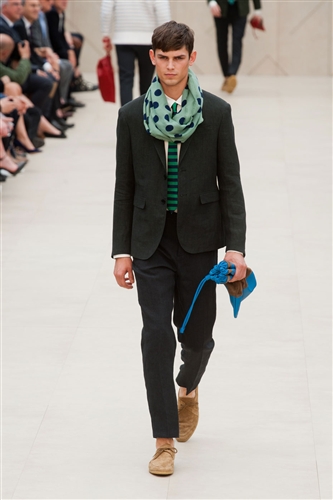
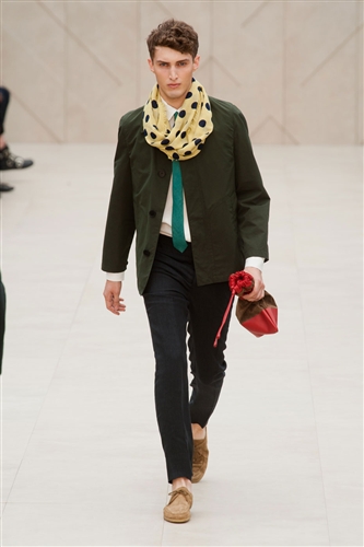
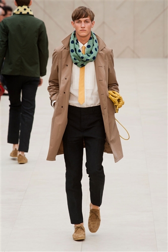
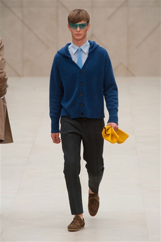
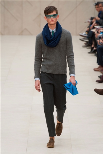
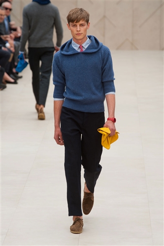
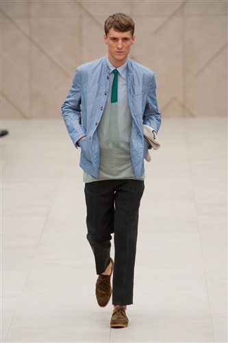
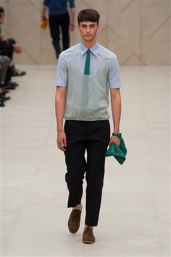
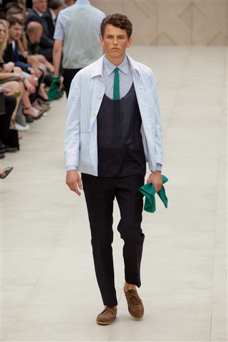
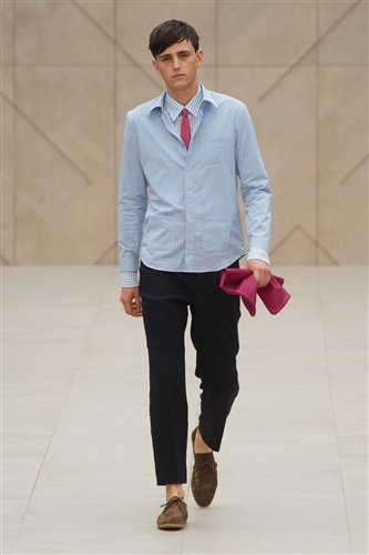
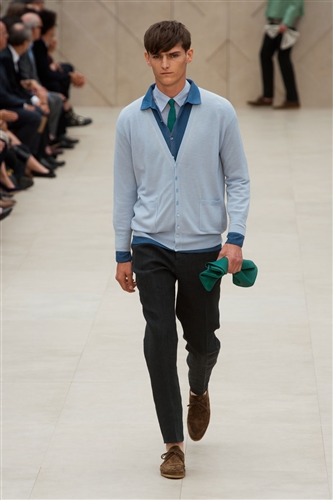
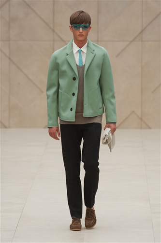
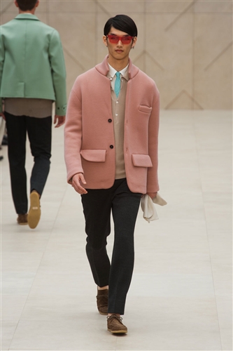
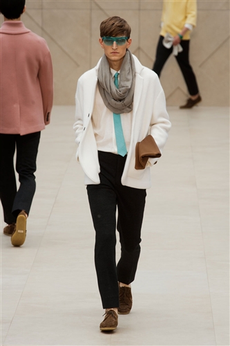
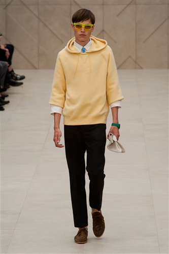
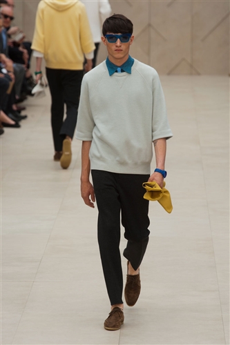
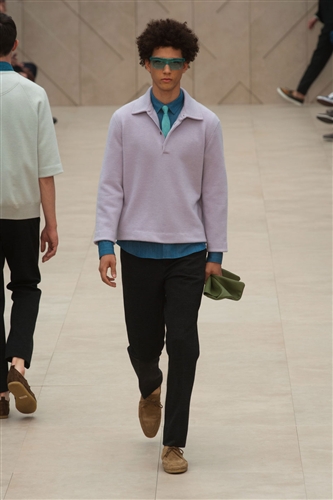
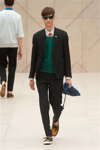
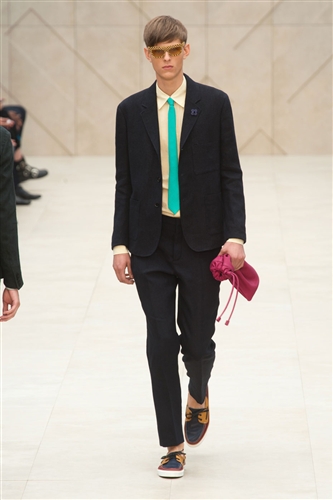
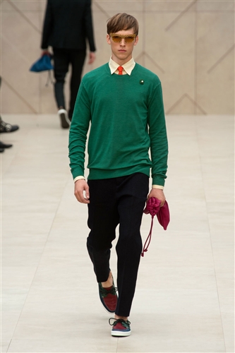
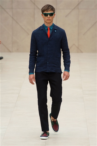
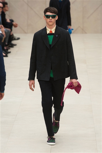
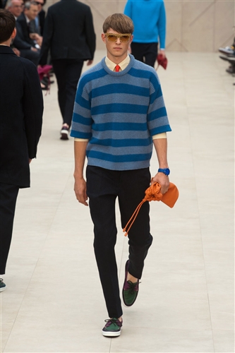
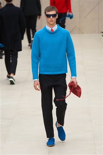
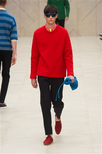
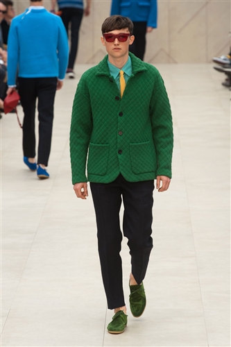
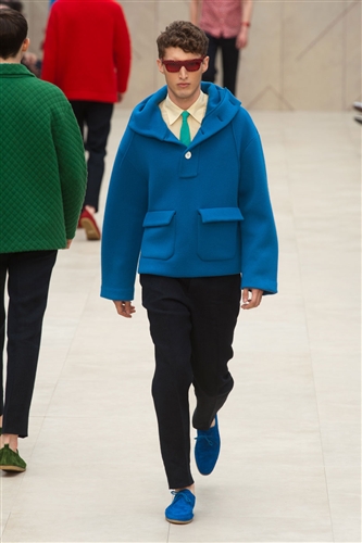
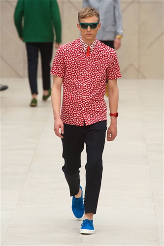
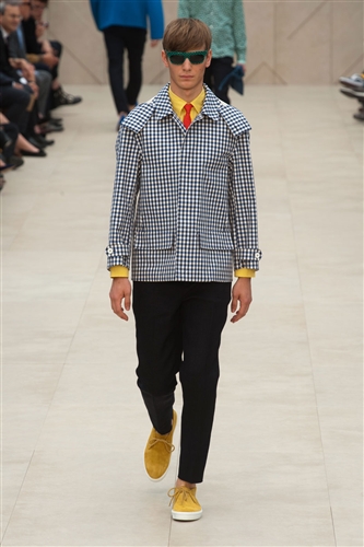
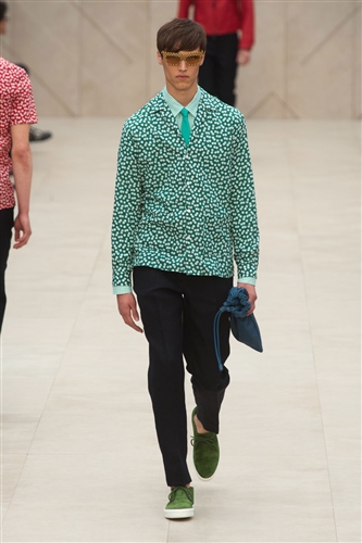
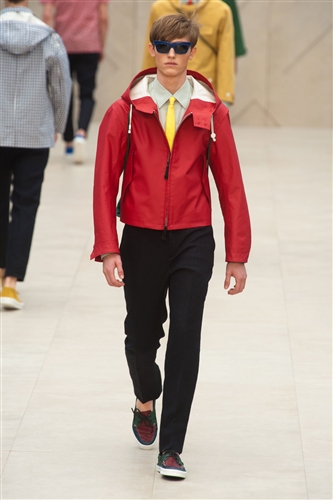
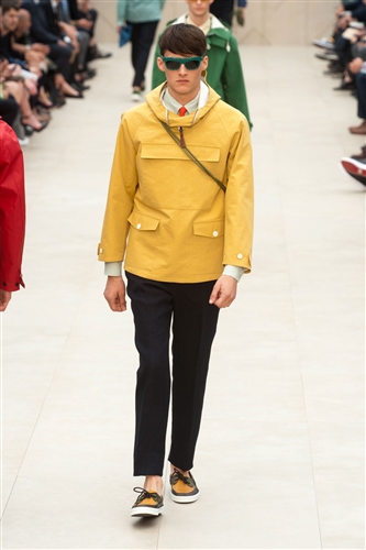
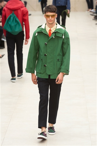
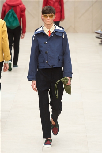
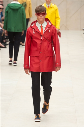
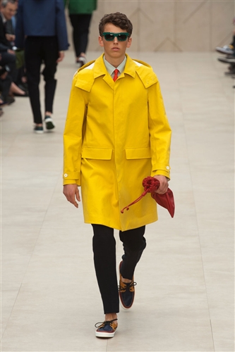
Spring-Summer 2014 – The main intention of Burberry this season was colour blocking, there was almost every colour under the sun used, from bright yellows and primary colours to more muted pastel colours. Clashing prints were also used to make this collection really fun and summery. There were polka dots, stripes and gingham; all in clashing colours. The use of layering meant that this collection would be really practical for summer, the overcoats and raincoats for when the weather is less than desirable and the cardigans and shirts for when it gets warmer. There wear also snoods, sunglasses and bags, showing just how versatile it could be. Although the collection was quite casual, mainly because of the eye-popping colours, it could also be dressed up with a somewhat wacky tie, or made more relaxed with a quirky anorak we have come to expect from Burberry.